Alignment Container
Description
The Alignment container can be used to left, center, or right align groups of controls.
Discussion
When you select an Alignment container you can set standard set of properties for container. If you set the alignment to left or right, then you can also set an offset property to control distance of the controls from the left or right edge.
All of the controls in an Alignment Container render on their own line, regardless of whether or not a break follows the control.
If you want multiple controls to be on the same line, you must wrap the controls in a container and then the Alignment container will align the enclosing container.
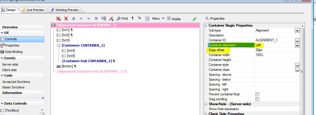
The image below shows how the above definition renders (but with the alignment set to Center, not Left as shown in the image).

The width of the Alignment container has been set to 100% and the width of the first three textbox controls have been set to 50%, 75% and 33% respectively. The controls are all horizontally centered in the container.
The txt4 and txt5 controls both appear on the same line because they are wrapped in a standard container with a width of 2.5 inches. The container itself, which has a red border, is horizontally centered.
Videos
To learn more about the Alignment Container, watch the videos below:
Alignment Container
The Alignment Container makes it easy to Left, Center or Right align a series of control on a UX.